"THE WORK"
"Brand Development Showcases"

BRAND NAME: THE MINK LABEL
PACKAGE USED: BASELINE
TAGLINE: "Luxury lashes, Effortlessly Yours"
BRAND MISSION: To empower clients to feel confident and glamorous every day with high-quality, cruelty-free mink lash extensions tailored to their style.
TARGET AUDIENCE:
Women aged 18-35
Beauty enthusiasts who prioritise self-care and luxury
Social media-savvy clients who love aesthetics
BRAND VALUES:
Luxury & Elegance
Sustainability & Ethics (cruelty-free, eco-friendly packaging)
Precision & Expertise
BRAND PERSONALITY:
Sophisticated yet approachable
Detail-oriented & professional
Glamorous & Confident
VISUAL IDENTITY:
Colours: Soft black, beige, gold accents


TYPOGRAPHY: Elegant serif for headings, clean sans serif for body text


KEY OFFERINGS:
Classic, Volume & Hybrid Lash Extentions
Lash Lifts & Tints
Lash Aftercare Products
MARKETING STRATEGY:
Custom lash sets
Instagram & TikTok tutorials and client consultations
Brand ambassadors
Loyalty program for repeat clients
Lash subscription service
IMAGERY INSPO: Close-ups of lash extensions, soft focus portraits, minimalist luxury imagery


BRAND NAME: PRESSED & LINKS
PACKAGE USED: AESTHETIC LAB
TAGLINE: "Your hair, Elevated"
BRAND MISSION: Pressed and Links transforms everyday hair into a statement, combining expert technique with modern elegance
TARGET AUDIENCE:
Trend-conscious clients aged 20-40
Professionals & creatives who value premium hair care services
Individuals with curly & coily seeking personalised haircare regimes & experiences
BRAND PILLARS:
Craftsmanship - expertise in cuts, colour, extensions and styling
Innovation - Use of modern techniques & products
Self-Expression - Empower clients to express individuality through hair
BRAND PERSONALITY:
Trendy yet approachable
Artistic yet professional
Confident & Inspiring
VISUAL IDENTITY:Colours: Deep charcoal, gold, muted peach


TYPOGRAPHY: Modern serif for logo, clean sans-serif for headers
CUSTOMER EXPERIENCE:
Personalised consultations for each client
In-salon and digital hair guides
Seasonal promotions & workshops
MARKETING STRATEGY:
-
Social media reels showcasing transformations
-
Collaborations with popular Afro haircare brands
-
Client spotlight campaigns to foster community
-
Hair subscription service
IMAGERY INSPO: Minimalist salon shots, hair textures in motion, client portraits


BRAND NAME: NAIL EDIT
PACKAGE USED: CREATIVE CONTINUUM
TAGLINE: "Curated Nails, Crafted to Perfection"
BRAND CONCEPT: The Nail Edit is a retro, fashion-forward nail studio that transforms nails into miniature editorial canvases. Inspired by 70s funk, Y2K aesthetics and playful pastels, each nail set feels like a curated fashion statement. Feminine, bold and nostalgic.
TARGET AUDIENCE:
Not gender specific, aged 18-35
Trend-conscious, social media savvy
Fashion-forward clients who love expressing individuality
Clients drawn to retro, playful and creative aesthetics.
BRAND VALUES:
CREATIVITY - Nails as a form of self-expression and art
QUALITY - Precision and care in every set
TREND AWARENESS - Staying ahead of fashion, colour and design trends
FUN & PLAYFULNESS - Encouraging joy and difference through vibrant & retro inspired designs
CLIENT EXPERIENCE - Making every appointment feel like a mini editorial session
BRAND PERSONALITY:
Bold & Playful
Trendy & confident
Fun yet professional
Nostalgia with a modern twist
Expressive and editorial
VISUAL IDENTITY:
Colours: Muted green/yellow, soft strawberry pink, lilac, espresso brown
TYPOGRAPHY:
Seashore -retro script
Quicksand - rounded sans serif


KEY OFFERINGS: Biab overlaysSculpted extensions Editorial sets
MARKETING STRATEGY:Monthly trend drop release - clients receive moodboard + palette + designsChoose a look - allow clients to book from the monthly editNail transformationsCreate a set with me (tiktok, instagram reels)
WHAT THE BRAND OWNER RECEIVES EACH MONTH:
TREND UPDATES - Monthly palette, style and design recommendations
CONTENT SUPPORT - Templates, post layouts, or social media suggestions
VISUAL REFRESH - Moodboards, mock graphics and campaign ideas
STRATEGY CHECK-IN -Monthly report on brand alignment, engagement and opportunities
IMAGERY INSPO:
Editorial nail close-ups
Pastel or colour-block backgrounds
Funky props (mirrors, checkered patterns, bold backgrounds)


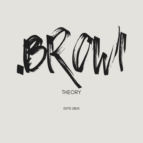
BRAND NAME: BROW THERAPY
PACKAGE USED: BASELINE
TAGLINE: "Brows that make a statement"
BRAND CONCEPT: To redefine brows through balance, structure and tailored artistry. Creating brows that enhance individual features rather than overpower them.
TARGET AUDIENCE:
Women aged 18-40
Clients who prefer natural, polished brows
Beauty enthusiasts focused on facial harmony
BRAND VALUES:
Harmony and proportion
Natural enhancement
Technique-led shaping
Client confidence
BRAND PERSONALITY:
Feminine and structured
Soft
Calm, professional
VISUAL IDENTITY:
Colours: Nude, Espresso, Brown, White
TYPOGRAPHY:
Geometric sans serif- glacial indifference
Modern serif or Didone typeface- Bauer Bodoni condensed


KEY OFFERINGS:
Brow Shaping
SPMU - Microblading
Brow tint + shaping
Brow lamination
MARKETING STRATEGY:
TikTok transformations
Brow mapping videos
Brow symmetry tips
Aesthetic before/after reels
Monthly theory-based tutorials (Therapy session Ep 1, etc.)
IMAGERY INSPO:
Before/after brows
Soft portrait lighting
Brow mapping tools
Clean treatment space visuals


BRAND NAME: The Skin Architect
PACKAGE USED: STUDIO BUILD
TAGLINE: "Where Skin Meets Science"
BRAND CONCEPT: The Skin Architect specialises in skin transformation through precise, clinical-grade techniques paired with luxury facial experiences. The brand elevates skincare. Every treatment is a blueprint for long-term, science-backed skin health.
TARGET AUDIENCE:
Men & Women, aged 22-45, who are invested in long-term skin health rather than quick fixes
BRAND VALUES:
PRECISION - Treatments rooted in science and technique
TRANSPARENCY - Educated clients create the best long-term results
INNOVATION - Advanced methods and high-performance formulations
CARE - Skin health over trends
BRAND PERSONALITY:
Clinical yet warm
Knowledgeable, not intimidating
Minimal, professional communication
Educator's tone: calm, clear, reassuring
VISUAL IDENTITY:
Colours: Soft Ivory, Charcoal grey, sage green


Typography:
Museo Moderno - geometric sans-serif
Bebas Neue - condensed sans serif


KEY OFFERINGS:
Clinical-grade facials
Deep hydration therapies
Acne & texture skin corrections
Skin barrier repair programs
Equipment-led treatments (LED, dermaplaning, etc.)
MARKETING STRATEGY:
Structured consultations
Progress tracking
Personalised skin "blueprint" post-treatment plans
Monthly facial membership
Giftcards
IMAGERY INSPO:
Clean studio environments
Textural skin close-ups
Tools & products laid out with precision
Soft natural light


